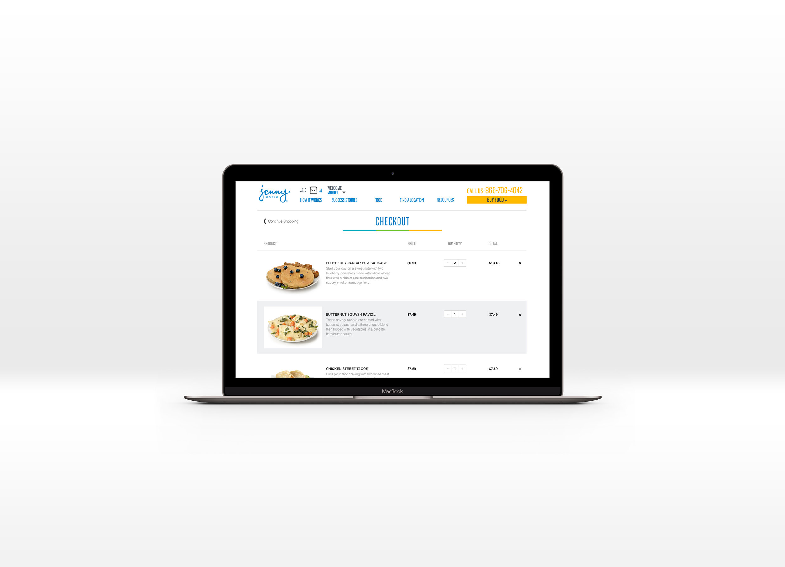
Jenny Craig Website
Checkout Redesign
UI/UX - Customer Experience - Business Management
The following is a redesign of the Jenny Craig eCommerce checkout process for their products online. This project was undertaken because of a replatforming for their the companies eCommerce system. Because of that, the design and development teams needed to develop an entirely new checkout process. I was tasked with redesigning the new checkout process, for both mobile and desktop.
This redesign was conducted while working for Jenny Craig.
Project Details
Objective: Deliver product redesign for responsive website design
How: Responsive design, improved customer flow for checkout process as well as improved user experience for eCommerce
Role: User research, product design, wire-framing, high-fidelity mockups


